PREREQS: Defining Color
Hue shifting is the practice of changing not just the saturation and/or lightness of your colors when shading and highlighting, but also the hue. This technique can really add some dynamism to your minis.
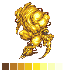
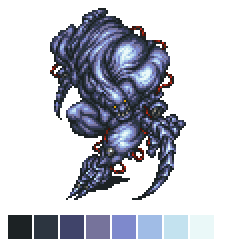
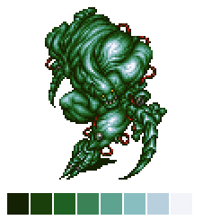
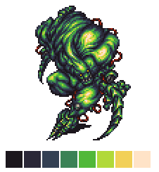
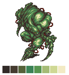
To demonstrate, we’ll use pixel art. Here’s a sprite from Final Fantasy VI:
This sprite has very minor hue shifting, with the biggest change in hue occurring on the final highlight. Well, that’s nice, but let’s make him green, because frankly it looks cool as hell hue-shifted!
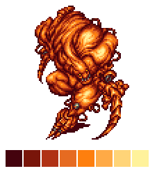
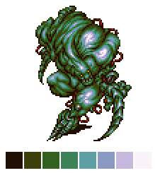
First, off, I’m feeling lazy. Let’s let someone else do a little work for us, shall we? I’ll go to http://mycours.es/colorRampCreator/ and make an eight color ramp with no shift.
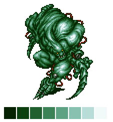
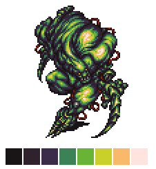
This tool creates a little palette of eight colors, dark to light. It decreases the saturation and increases the lightness with each step. He doesn’t look so bad in green, eh? You could paint a mini like this with relative ease, mixing in black from the midtone to get a shade, and white to get the highlights (this would actually decrease saturation in the shade too, but never mind!).
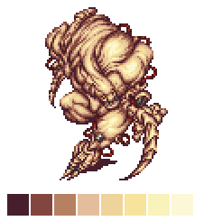
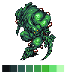
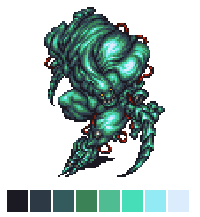
Too bad it’s BORING! Let’s play with the color ramp creator tool, shall we? We’ll increase the shift to 5, then 10, then 20
This is fun but it’s not doing things the way I prefer for green. The hue is shifting, but toward yellow in the shade and blue in the highlight. The saturation is also still going up in the shade and down in the highlight. There’s times when this is the kind of shifting you’d want, but for now let’s step away from the online tool and in to an image editing program, where I can use the color wheel to manually select shifted colors.
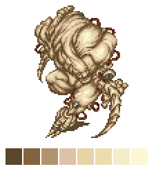
First, it’s important to know the first three colors in our ramp are the shades, the fourth color is the midtone, then we have three progressively lighter mid-tone highlights (from now on I’ll call them tints) and the eighth color is our lightest highlight. For pixel art this is fine…for a mini I would probably have one less tint.
I would also only have three or four paint colors for a mini — the darkest color, the midtone, the lightest tint, and white (either mixed into the lightest tint or straight) for a highlight, if the material is shiny. The rest of the entries on our ‘palette’ come from mixing and/or blending!
Okay okay just shift the hues already!
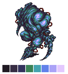
The basics are the same for each of the following images. The shades move further and further toward blue and purple from the midtone, descreasing in saturation and lightness.
The first two tints move toward yellow, and increase in saturation and lightness. The last tint and highlight both decrease in saturation and increase in lightness, with the biggest leap in lightness on the actual highlight color.
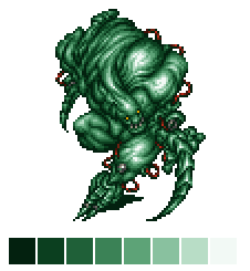
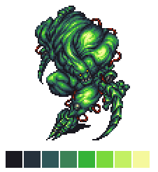
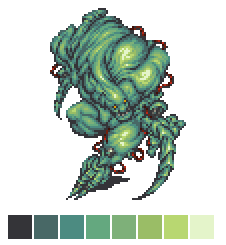
This one doesn’t push it too far — the shades are teal, but all the tints and highlight are still solidly in the green part of the color wheel.
This pushes it further. We’re nearly purple on that darkest shade and solidly in the yellow on that highlight. And what a difference!
Anyway, let’s keep going, shall we?
Here we’re making such a big leap with each shift that we have a golden yellow and the highlight is peach! The darkest shade is really, really purple actually. Okay, just one more, to show what it looks like when you push things, in my opinion, a little too far.
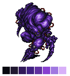
The darkest shade and highlight are so far away from the midtone they’re actually only about 20 degrees away from each other on the color wheel in Photoshop — the highlight is just a much lighter, slightly yellower red than the very dark red shade. It almost looks more muted and less dynamic than the previous example, right?
Okay, so obviously hue shifting is pretty cool for pixel art, but how about in minis? Well, I’m still getting the hang of it, so lets let Games Workshop show us!
Here is hue shifting in play on Slambo, though it’s less saturated all around, so we’ll stick the same palette on our sprite, for comparison’s sake.
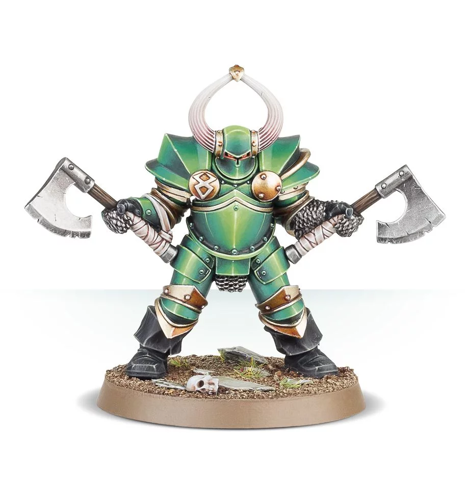
To get this effect in paint, you would begin by selecting a green mid-tone paint. Then, pick a dark purple or dark teal paint, and probably both a light yellow green and a very light yellow (or white!) just for that last ultra light highlight.
For a more muted, realistic look, you might shift both the shades and tints toward red and yellow:

And for a very different look, you can move the hue of both your shadows and highlights toward blue and purple.
As with all hue shifting, the harder you push it, the more dramatic the results. I (obviously) really recommend playing around with recoloring pixel art to practice this technique. Here’s a few other colors besides green. Can you tell how I shifted the hues for each effect?