Color — such an important part of miniature painting. A good color scheme can make a middling paint job impressive (trust me!) and a bad color scheme can make a stellar paint job really boring.
To get started, lets get on the same page about how to talk about color. Every color has a hue, value, temperature, and saturation.
For our purposes, hue is the color family or category your color is part of. A common breakdown is of course the rainbow. There’s science about wavelengths about why these are the categories, but working with light is not the same as working with paint.
So, although this is by no means the only way to do so, I generally use the following color families when talking about hue:
Hue do you do?
Red, orange, yellow, brown, green, teal, blue, and purple. Why does teal get its own family and magenta doesn’t? Because fuck magenta, that’s why!
No, it’s because magenta shares the same conceptual space as purple for me. You may have your own color families.
One more thing: although I would classify monochrome (white to black) as its own color family, white, black, and grey are technically not hues! Isn’t it fun to learn?
Value, valme.
Value is how light or dark your paint is. In the world of paints, a tint is a color given a lighter value with white, and a shade is given a darker value with black. And a tone is a color desaturated with grey, which may of course also make it lighter or darker.
I don’t have too much to say about this one, I just needed to define it.
Taking your temperature
When I talk about a color’s temperature, I mean whether a color is warm, cold, or neutral. You might call it the undertone. It’s true that this has something to do with saturation, but it’s certainly not the only thing!
Any color can really come in any tone or temperature. It’s difficult to demonstrate digitally, actually! And, the same color can appear to have a different temperature depending on what it is next to. Like two people sitting in the same office, one of whom is in a sweater and one who is sweating in a light shirt, temperature is relative.
Well… that sucks! It extra sucks because with multi-pigment paint (which is basically 100% of mini paints), a color might be hiding pigment that changes how it mixes with other colors. So being able to recognize the temperature of your color can make a difference in whether it mixes as you might expect or not!
I don’t have any real tips for this one besides doing something like comparing your color to the colors on either side of it in the spectrum and seeing if it has a bit of a “lean” toward one. For instance, a blue that looks more teal (or green) is probably warm and maybe even harboring a little yellow or green pigment. Probably. If it looks more purple, it’s cooler. Usually. Sorry!! Some things we learn through trial and error.
Gotta keep ’em saturated!
So, saturation, if you haven’t noticed, is my favorite aspect of a color! It’s essentially how grey a color is. The more grey, the less saturated. Natural objects are usually more on the low to middle saturation scale, shadows are usually less saturated, and going with fully saturated colors across your whole mini can look pretty garish.
But, saturated colors can also add a lot of vibrance to your work, so don’t be scared of them!
Since saturation is way easier to play with on the computer than with paint, let’s take a look with our friend the recolored Final Fantasy VI sprite:
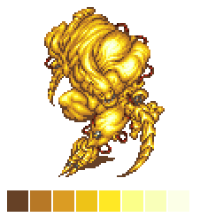
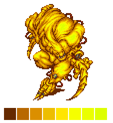
The hue (and brightness) is the same for each color, but saturation for the right example was put to 100. So, the highlights are flattened and the shadows look super cartoony.
It’s also kind of hard to find paint this saturated to start with. But, it’s still important to tell how saturated a not-100 percent saturated color is, because it does effect the whole look of the mini, and playing with it can help you control focal points!
You can usually make a color look more saturated by mixing a yellow in to it (not white), and less saturated with, well, grey, but a tinted grey with a complementary color may be more interesting (see the hue shifting tips). If you mix yellow in to purple you create a quantum state of saturation and have to abandon your project, sorry!
Okay, now that you know what I mean when I say words, we can really get started on talking about color.